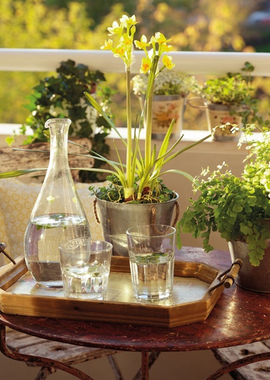
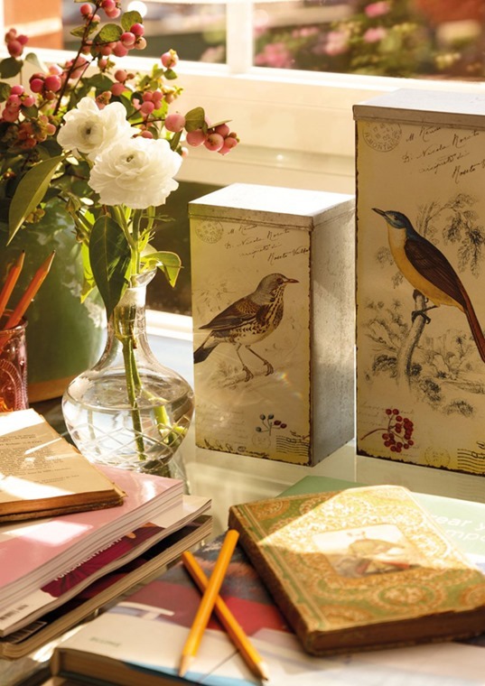
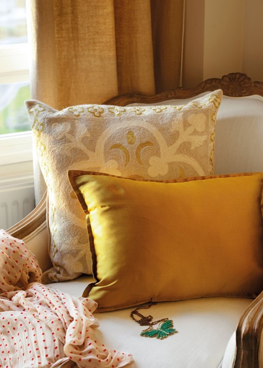
Oh the glamour of my life at the moment! I am currently sitting amongst a pile of half-packed boxes, I have not brushed my hair (for the whole weekend), I have broken and chipped nails and I smell like Eau de Hard Labour. I can assure you, it’s so not pretty. Which is why I am spending every spare moment I have, perched on a box or sprawled over bubble wrap, trawling the internet for inspiration for our new home. Anything pretty, neat and tidy is gets pinned. You’ll also notice that I have been posting a few homes from Spanish magazine El Mueble. Apart from the homes being jaw-droppingly beautiful, the light in the images seems to draw me in like a moth to a flame. It’s soft, warm and inviting. I am not sure if it’s a clever little Photoshop trick or if the light is this incredible in Spain?
Thoughts?
Images via


It is beautiful light, you're right. My favourite photo is the little dining area - I have a special love of round and oval tables. Good luck with your packing x
ReplyDeleteSorry but I can't help laughing at Eau de Hard Labour--so funny :) I like the small pops of color and I love lots of cushions in that day bed.
ReplyDeleteI've always wondered this, too. The light always seems so much better in photos of European homes. I don't think it's a Photoshop filter, but just the unfairness of the world! Relegating me to the side of the globe without such lovely light. That first room would make a perfect writing office. Drool!
ReplyDeletehow pretty. i love all their chairs too. the light is so amazing! it has a golden and diffused quality to it. my house never looks like that : /
ReplyDeletei wonder if it's that more thought is given to the position of houses? i know here it's not - wherever it fits is where it goes. but i know i curse daily at my house because my wall of windows should be facing the other direction!! it seems criminal to me that they didn't think of that in the building process.
agreed! that is gorgeous!
ReplyDeleteWe've been to Spain and the light is beautiful so we don't think these are retouched! Between your Monday Snoop and our Monday Mood, things are lightening up around here.
ReplyDeletexxoo
C + C
Oh what a warm and soothing pallet of colors. I love the coziness, airy feel and lived in feel.
ReplyDeleteIt's def hypnotizing ... for some reason I now want to simply relax and sip a cup of tea (though, in spain it would be coffee). Thanks for the reminder ... I haven't finished reading my El Mueble mag. Ooooh, I miss Spain :(
ReplyDeleteAda | www.adasinteriordesign.com/blog/
These are rooms I want to spend a Sunday morning in!
ReplyDeleteOoooh I am not a fan of the packing / unpacking part of moving but the actual going to a new place part is quite fun!
ReplyDeleteThat house is stunning. I wonder if I'd be as drawn to it on a cold and misty day? So many windows, I bet it's always light filled. Even on dark days. But that light? Perfect. Dreamy.
ReplyDeleteLauren @ still + life