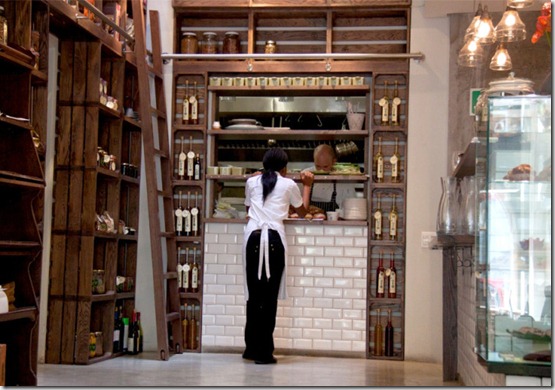
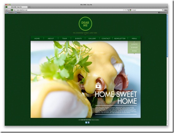
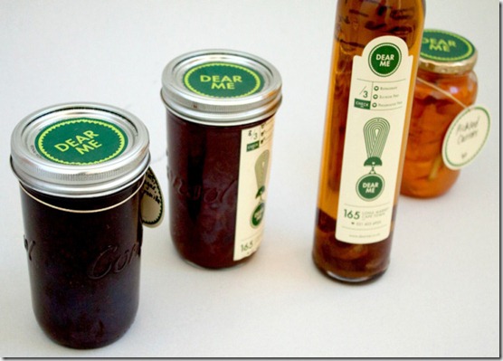
Brilliant branding is just one of the many things that helps me sleep at night. I guess I am just funny like that. I’m in awe of people who have the creativity to create consistent and well-thought-out concepts that can transform the ordinary into something truly special. Dear Me, a Cape Town based deli and brasserie, is an example of branding that has me sighing in contentment. The brand identity was designed by Daniel Ting Tong and personally, I think he has thought of everything – even the invoices are a sight to behold! I also really love the clean and simple product labels and the clever recipe cards. Aside from genius branding, Dear Me looks like the perfect place to enjoy a bite to eat and watch the world go by.
You can read more about Daniel’s work here.
Images via


I love great branding too, that's definitely the graphic designer in me coming out. Love Daniel's work, and what a cool name - Ting Tong :) x
ReplyDeleteYou're right, the branding is fantastic - really simple but memorable. Love the interior too! Have a lovely day xo
ReplyDeleteYES! I'm a sucker for great branding, too. I love the packaging they have designed here - fab.
ReplyDeleteOh I love these sort of places, perfect for just sitting back and as you said watch the world go by. I saw your About Me page and saw that you are from South Africa! Well I have been there and it is such a beautiful country, I really wish to go there again.
ReplyDeleteThis is definitely my kind of place. I love all this attention to detail - the labels and the invoice - it makes such a difference. Great interior - stylish yet relaxed. If I lived near there I would be forever popping in!!
ReplyDeletehttp://missbbobochic.blogspot.co.uk/
what a cool store! I love your blog~
ReplyDelete-liv
http://chocolivlovelaugh.blogspot.kr
That place looks so cool! And the branding is definitely spot on.
ReplyDeleteI'm such a sucker for good branding. Good thing I don't live close by or else I'd take it all!
ReplyDeletei love it. it's so difficult for me to go with simplicity. i am in awe of people who can go so simple yet make such an impact and have a unique feel. love it. but now my stomach is rumbling something terrible. the branding is good but that food looks even better! xo
ReplyDeleteI would be happy to take a break and work from there for a few hours. It looks lovely.
ReplyDelete"Dear Me" looks like such an inviting cafe. I'm adding it to the list of places to visit, on my next visit "home". Baie Dankie!
ReplyDeletethis place looks so great. I love they logo and all their branding as well. Some day i'll visit cape town and check it out!
ReplyDeleteThat looks great, any plans to bring it to the UK?!
ReplyDeleteaw i agree - it is fun to see someone invest in to the look and feel of their business, it definitely ads to the experience!
ReplyDeleteThis was a cool post! His work is inspiring!
ReplyDeletemake this reason number 1,000 i have to get back to capetown for a visit.
ReplyDeleteBranding is something I always look for within a brand. With that being said I love how simple the logo is and the color "green". Very cool!!!
ReplyDeleteLove the simplicity yet the perfect match with the rustic feeling of the shop. And a great shade of green
ReplyDelete